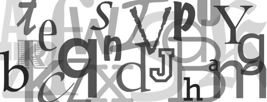
There are a lot of fonts out there, so many that choosing a font for your website could become an overwhelming decision. Before you concede and thoughtlessly choose an arbitrary font, you should first know how important your choice in font is to your site.
Presumably, your website is providing useful content and this content is probably communicated via text. You want people to read this text, right? Typography is a fine art form filled with intricate details, such as weight, kerning, axes, strokes, and counters. These elements affect how we read, although we are rarely conscious of it. The font that you choose could determine how much text your visitors read and how effective your site is.
Font as design
You should consider your font as part of your design. Remember, letters are images themselves, just images that we read. A font can either enhance or detract from the theme and feeling of your web design. Say you have a website about babies. You would probably use a pastel color palette to create a delicate and whimsical site. You should choose a clean and lightweight font to match and reinforce the overall theme of the site. Viewing the text as an image, as part of the overall “look” of the site, will help you better decide which font will fit best with your site.
Choose an accessible font
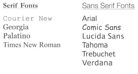
Although there have been hundreds of fonts created, there are surprisingly few that are ready to use on the web. The reason for this is that different operating systems offer their own font packages and only a few of these fonts overlap across operating systems. Although I don’t personally prefer any of these fonts, I’d recommend choosing one of them. You’re going to be integrating your text in with your design, so you want everyone to view the design as intended. If you choose a font that not everyone has loaded onto their systems, some people are going to be seeing your site with a default font. Your design will feel disjunct and it would appear as though you didn’t put any thought into your font choice. To avoid this pitfall, choose from the list of universally web-ready fonts and integrate it into your design from the beginning.
The list of universally available fonts is slowly growing, with better fonts such as Cambria and Candara coming into the picture. In an ideal world, all fonts would be loaded onto all systems to open up design possibilities. Until then, I recommend sticking to the limited list.
If, however, you strongly feel that a special font is imperative to your design (especially for headers and titles), you don’t necessarily need to throw it out of the question. You can turn your special font into an image and upload it to your site. Everyone will now be able to view your font as an image. Just be aware that if you want to make any changes to the content at all, you’re going to have to edit the image itself, which is much more tedious than going in and editing text.
Serif vs. Sans serif
You’ll notice that fonts can be categorized in a variety of ways. The most basic separation is serif and sans serif. A serif is that foot that sticks off of the ends of letters. Sans serif fonts don’t have this, but rather just end at the line of the letter.
Serif
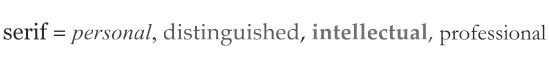
Generally, serif fonts are better for print material. The serifs help create space between letters, making the text more readable. Moreover, the serifs form a nice line along the bottom that helps the reader follow along the line on paper. If you have text (like a pdf file) that’s meant to be printed out on paper, you should try a serif font for this. Serif fonts look very different from sans serif fonts, so they communicate a different feeling. Oftentimes, serif fonts communicate a sense of being personal, distinguished, intellectual, and professional.
Sans serif
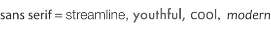
Sans serif fonts are generally better for the web. Many computer screens don’t have a high enough resolution to capture the fine details of the serifs, so they can appear blurred and unclear. On a screen, sans serif fonts appear cleaner and thus more readable. Sans serif fonts communicate feelings of being streamline, cool, youthful and modern. The most popular web font at the moment seems to be Verdana.
Using multiple fonts
You’re not necessarily bound to one font. In fact, mixing fonts can add dimension to your design. It can also help delineate different types of text. For example, all of the informational text can be a standard sans serif, quotes can be italicized sans serif, and titles can be a larger serif. If you decide to do this, use a discerning eye because it can easily become too busy and tacky. Also, keep your choices uniform and consistent. For instance, make sure all of your text links are of the same font (underlining them is pretty standard) to communicate that “this is what a link looks like on my site.” Here are some good examples of well-mixed fonts.
Don’t use Comic Sans
Don’t use Comic Sans. It breaks every typography rule, making it unpleasant and unreadable. It also makes your site look amateur. The only instance I can think of where Comic Sans would be appropriate for the design and message of a site, is if you had a site that was about how not to design a site, or if you wanted to ironically make fun of middleschoolers.
Off you go!
There really isn’t a “best font” out there. There is however, usually one font that is better than others for your particular design. Every font serves a different purpose, so your choice in font depends on the design of your site and what you want your site to communicate. Just remember to keep the viewer in mind. You also want them to read your content, so make it as legible and accessible for them as possible. Choosing the right font can help you communicate your message more effectively, so choose wisely!
About Author:
Nina Wu writes for A Small Orange.